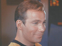
Thanks to Mr. Mugato on the TrekBBS, we now know that Bill has his own font!
The Classic TOS font has a tendency for it's components to slant upwards to the right (if you know what I mean). For example the crossbar on the letter "H" is not horizontal, but slants upwards to the right.
However, the only time it does not, is in William Shatner's opening titles credit.*
The "H" in Shatner is perfectly horizontal, while every other time the font is used (closing credits in the 2nd and 3rd season etc.) it slopes up to the right.
* Note that this has been "corrected" in the HD versions


2 comments:
The strange thing is, I'm really not that surprised that even printed fonts yield to the bending will of William.
The letter "H" stood at attention when it realized it was a part of his name in the credits, he commanded so much respect.
Post a Comment